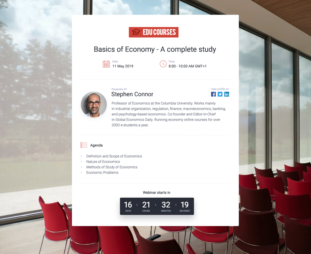
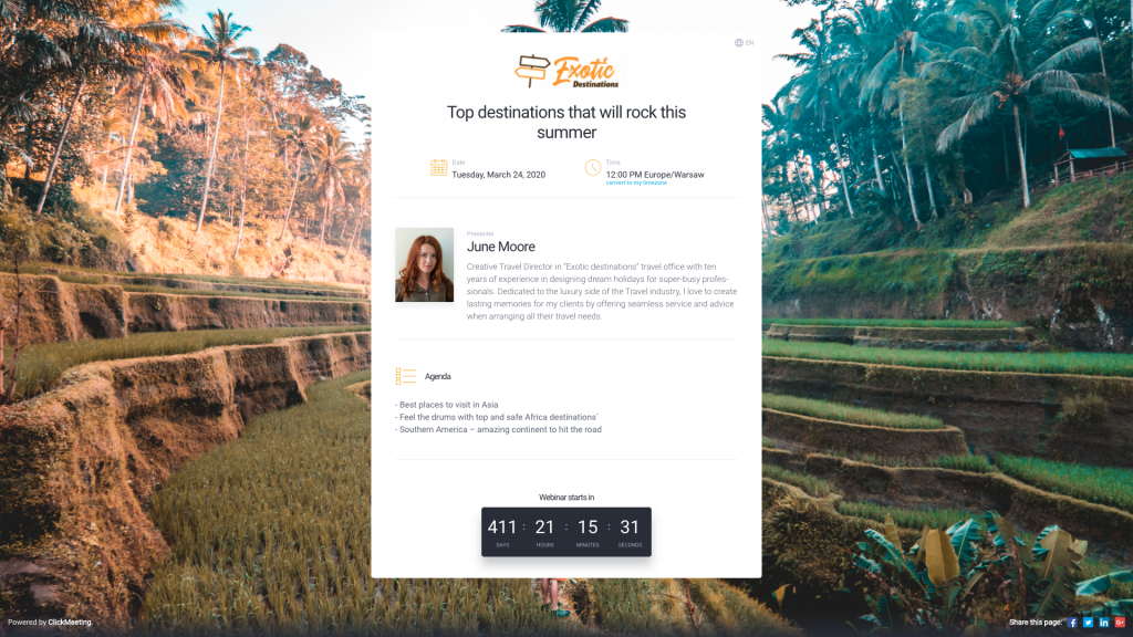
Have you done your homework and defined your business niche? Have you recognized and studied your target audience? Great! That already puts you in the head of the digital business peloton. Now, it’s time to strike your future customers with a unique and professional webinar look. How?
Have a glance at our new Custom Branding feature!
Only seven seconds – this is how little time we all have to make a great first impression. This also applies to online business in general and running webinars in particular. No matter what sector you decided to focus on.
What does it mean in practice?
It means that whether your choice is:
- monetizing your financial know-how with paid webinars,
- teaching software development with online courses,
- or pitching your travel offer with a product demo,
at the end of the day, your ultimate goal is to make a positive impact on your audience. And, above all, to expand your customer base and increase your revenue.
Table of Contents
How can you convert your webinar attendees into customers?
According to the latest surveys and reports, webinars serve as an efficient form of premium marketing. They do a great job of delivering valuable and relevant content for future customers (especially in B2B stratosphere).
How to make it work?
Here it goes:
Start with building trust
Step aside for a minute and put yourself in customers’ shoes. Imagine a situation you know very well. As a customer, you want to solve the problem or fulfill your need, and you’re motivated enough to spend money on a solution. To make it come true, you eventually land on a web page to check the offer.
It might be an e-commerce site, a marketplace, an online courses platform – you name it. If it doesn’t look professional or compelling, you lose your interest in a particular brand. Why? Because you won’t believe that the offer is worth paying for if the brand did a lousy job in designing their own website.
Now, think like an entrepreneur again. To make your target audience gravitate to your webinars, you need to make your webinars pages look outstanding!
First of all, you need to identify each step in your webinar attendees’ journey. When you schedule your webinar, your attendees will come across these pages (in THAT order):
- Registration page
- Profile page
- Waiting room with an agenda
- Webinar room (the heart of your webinar)
- Thank-you page
The more attractive and consistent they look, the higher level of trust you will achieve!
Luckily, it’s easier than you think! Even if you’re not a designer.

Custom branding – design it all with a few clicks
Since you are this far with building your commercial offer and creating premium content, it’s doubly essential to do things right at this stage.
You have invested time, money, and effort in your campaign, so all you need to do now is to let your audience recognize who you are and what you do. In seconds!
After creating (or logging into) your webinar account, you need to go to the Appearance Settings.
Then, you need to follow these three steps:
Step 1: Your logo and brand colors – let everyone know it’s you
To cut to the chase – if your prospects decided to register to your webinar, it means that they are already familiar with your brand.
Get the basics behind you. Upload your logo and pick a theme color that will be consistent with your brand identity. As a result, they will be displayed on all your webinar pages.
Step 2: Amaze everyone with a stunning background image
This is where the magic happens! Choosing a background photo is not only about making your pages beautiful. It’s about visualizing your offer with ONE powerful image.
To match a background image with your brand, your business niche, and – most specifically – your webinar topic, you need to dive into a vast Unsplash photo base. It’s a free, professional photo directory, packed with high-quality and magnetic pictures.
For instance, if your niche is building web and mobile applications, type in phrases like “software” or “programming” in the search field and pick a photo that will be the best result.
Follow the same scenario if you run financial training sessions, organize online courses, or pitch travel offers with a product demo. Choose a keyword (or a set of keywords) that describe what you do and what you provide to your clients and type it in the search field. Take your time to browse the results and pick the most compelling image.

Why is it so important?
Because images speak louder than words. Your background photo visible on each of your webinar pages will be your digital business card.
In a blink of an eye, your attendees will exactly know what they will learn and how they will benefit by joining your event.
What’s next?
Step 3: Save the settings and start inviting
That’s it! You have done the designing phase. After saving your Appearance Settings, you are fully ready to start inviting prospects to your webinar.
Before you do that, take some time (and pleasure) to look through your webinar pages. Discover how outstanding your registration page, waiting room, and webinar room look now!
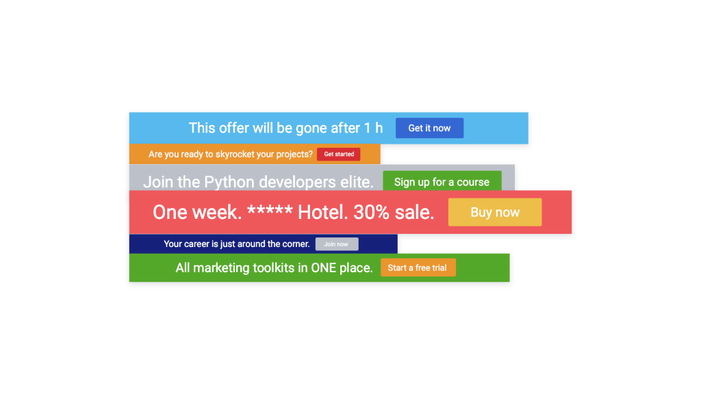
The final step – design your Call To Action
We’re coming back to the primary question – how to convert your webinar attendees into your customers?
After all, designing your customized webinars will build trust and make your attendees stay with you for more. However, it will pay off only if your attendees go eventually to your website – a landing page with a “sign-up” or “buy-now” form.
There isn’t a better way to get there than with an efficient Call To Action button. It’s something far more important than just a cherry on top. Everything you are trying to achieve with webinars will be possible only if you give your audience an easy way to take your offer.

Creating a customized Call To Action button will help you redirect your webinar attendees to your landing page and make the final click.
Ready to put this into action?
Creating a unique and audience-oriented commercial offer is the first milestone. The second one – getting it in front of the right eyeballs. Third – making a first positive impression on your target audience.
Webinars powered up with a professional, customized design will help you make an impact and start gaining traction to your website.


 (3 votes, average: 4.67 out of 5)


