
Looking to secure new customers, sell more products and services, and increase revenue? Sounds like you need a killer Call-To-Action! As luck would have it, that’s exactly what we’re talking about on the blog today. Calls-To-Action have the power to supercharge your business.
Keep reading to learn what a Call-To-Action is and eight tips you can use to craft them effectively. Let’s dive in and get started!
Table of Contents
Call-To-What Now?
If you’re new to digital marketing, you might be wondering what a Call-To-Action is. So, let’s start with a quick definition to make sure we’re on the same page. 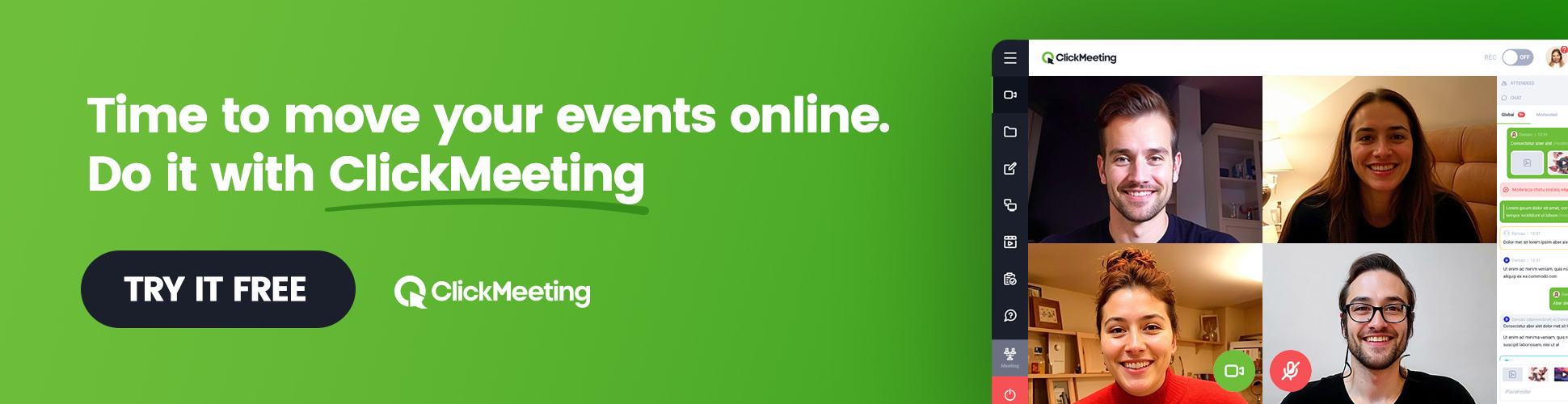
A Call-To-Action, often abbreviated to CTA, is any word, phrase, or expression that encourages viewers to do something immediately— buy a product, sign up for a newsletter, get more information, etc. For example, “Buy Now” is a popular CTA, as is “Sign Up” and “Learn More”.
CTAs are most often used on landing pages, email campaigns, and PPC ads, though you’ll also find them in website sidebars, blog posts, and even webinars.
But what’s the big deal? A few words can’t make that much of a difference, right? Actually, they can! Studies show that a highly optimized CTA can boost landing page conversion rates by 80% and revenue numbers by 83%. Ummm… Yes, please!
8 Tips for a Better CTA
The right Call-To-Action button can take a ho-hum marketing campaign and turn it into a revenue-generating machine for your business. The question is, how do you write one of these bad boys? Here are eight tips to help you out:
1. Write in First-Person
Think back to elementary school when you first learned about point of view, as in first, second, and third-person points of view. If you need a quick primer, don’t worry, we’ve got you!
-
First-Person. This form of narration is told from the writer’s point of view. You can identify this perspective by the use of first-person pronouns like I, me, and mine.
-
Second-Person. This form of narration is told from the reader’s point of view. You can identify this perspective by the use of second-person pronouns like you and yours.
-
Third-Person. This form of narration is told from the perspective of the person or people being written about. You can identify this perspective by the use of third-person pronouns like he, she, orthem.
Many studies have shown that writing Calls-To-Action in first-person can improve conversions. That’s why you’ll often see CTAs on a wide variety of web pages that say something like “Start My Free Trial” rather than “Start Your Free Trial”.
2. Use Action Words
Most Calls-To-Action should be short, which we’ll discuss in further detail in a later section. Because of this, it’s salient to start your Call-To-Action with a verb. That way, your readers know exactly what to do as soon as they see your CTA.
Take a look at the two examples below and decide which one is more enticing:
- “Our New Product is Available”;
- “Download Your [Product Name] Now”.
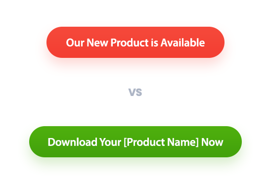
In most cases, the second CTA will perform better because it starts with an action word, which tells readers what to do in a way that will resonate with them.
In the same vein, use “power words” in your CTAs, too. A power word is any word that elicits a strong emotion in your readers. “Now,” “Bargain,” “Free,” and “Thrilling” all qualify.
3. Focus on Value
Why should your audience click on your CTA? Because the value you provide is crystal clear! Ask yourself, “What’s in it for them?” whenever you craft a Call-To-Action.
One of the best ways to do this is to make sure your Calls-To-Action are always results-oriented. So instead of saying “Submit Your Email,” say, “Sign Up for Free Insights”. The first part tells readers what to do. The second one tells them why they should do it.
In other words, it focuses on the value provided.
All great copywriters and marketing professionals know that the “why” is the key to higher click through rates. Your audience doesn’t want another product or a free eBook. They want a solution to their problem. They want the “why” you provide.
4. Create Urgency
Fear of Missing Out (FOMO) is a very real, very powerful emotion. Once evoked, it will entice your audience to act now instead of later. After all, nobody wants to feel like they passed up a great opportunity. Do what you can to include a sense of urgency in your CTAs.
The easiest way to do this is to mention a limited-time sale. “40% Off Today Only” will get people’s attention, guaranteed, and boost your click-through rate.
What if you’re promoting a webinar rather than selling products? You can still use urgency! Craft a Call-To-Action like “12 Spots Left — RSVP Now”. People who are interested in your event, but haven’t acted yet, will likely be motivated by this kind of CTA.
5. Keep it Short and Sweet
The best CTAs feature action words that focus on value and create urgency. But that doesn’t mean you can cram 25 words into your Call-To-Action. Doing so will make it tough to fit your CTA into a clickable button. It will also make it less engaging to your audience.
Try to be as concise as you can while still enticing your reader to click. Most experts agree that two or three words are ideal, though five or six are usually acceptable.
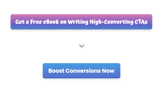
If you’re having trouble shrinking your CTAs, use these examples as inspiration:
“Buy Our Amazing New Product Right Now For 50% Off” —> “Save 50% — Buy Now”;
“Sign Up for Weekly Updates and Insights” —> “Sign Up Today”;
“Get a Free eBook on Writing High-Converting CTAs” —> “Boost Conversions Now”.
6. Make it Eye-Catching
So far, we’ve given you a lot of copywriting tips to help you craft awesome CTAs that entice readers to purchase a product or service. That’s because a good copy is essential. But it’s not the only thing that matters when it comes to Calls-To-Action.
The way your CTA looks will also dictate how effective it is. Here are a few design tips to help make sure your CTAs are eye-catching:
-
Give it a Button Shape. If possible, make your CTA look like a button. Why? Because this will signify to your audience that you want them to click on it.
-
Add a Splash of Color. Make your Call-To-Action buttons stand out by giving them a bright color. Then surround your CTA buttons with white space to make them pop.
-
Make it Easy to See. Don’t hide your CTAs in the corner. Make them clearly visible to your audience, so there’s no chance that they miss them.
Design elements like button colors and CTA placements really do matter. Don’t ruin an otherwise effective Call-To-Action by skimping on its look.
7. Use Numbers
Numbers can dramatically increase conversions and click-through rates because they help viewers quickly determine if an offer is worth their time or not.
Which Call-To-Action would you rather click?
- “Boost Your Conversions Today”;
- “Boost Conversions by 28%”.
Here are two more examples:
- “Shop Our Sale”;
- “Save Up to 40%”.
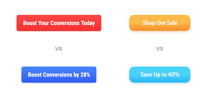
In all likelihood, you chose the second option in both scenarios. “Boost Your Conversions Today” and “Shop Our Sale” are somewhat vague. But “Boost Conversions by 28%” and “Save Up to 40%” tell audiences exactly what to expect if they take you up on your offer.
8. Test and Optimize
Finally, it’s important to test and optimize your CTAs.
All of the tips listed above have been proven to increase conversions and are a great place to start. But you won’t know if they actually resonate with your unique audience until you try them and then analyze the data. The best way to do this is via A/B testing.
So, craft a CTA and see how it performs. Then change its color, use a different action word, or place it in a different location and see if your results improve. Then rinse and repeat.
Just remember to only change one thing per test. That way, you can pinpoint which elements raise or lower your click-through rate and optimize accordingly.
Supercharge Your Webinars with a Call-To-Action
When you think about Calls-To-Action, you probably imagine landing pages and email campaigns, not webinars. But the truth is, tools like ClickMeeting allow you to craft awesome CTAs to include in your live broadcasts!
It doesn’t matter if you want to sell a product or service, promote a free download, or grow your email list, ClickMeeting’s CTA feature can help you do it.
With our tool, you can:
-
Write enticing pre-button and button text to boost click-through rates.
-
Customize your CTA button with various colors and backgrounds.
-
Choose when your CTA appears during your webinar and for how long.
-
Redirect webinar attendees to a custom website once they click your CTA.
Hosting a quality webinar will help you engage your target audience. Take full advantage by including a Call-To-Action button in your live broadcast that has the potential to increase sales for your company and the overall effectiveness of your event.
Does ClickMeeting’s CTA button feature sound useful? Give it a try today! Sign up for a free 14-day trial of ClickMeeting and experience the full power of our platform yourself.
Wrapping Up
A strong CTA will help you boost conversion rates and revenue numbers and grow your company to new heights — if you can write and design them well, that’s it. Fortunately, you now have the information you need to do so!
Keep the eight tips above in mind the next time you write a Call-To-Action for your landing page, email campaign, or webinar and you’ll have more success. Good luck!