How to stand out from the crowd in the digital business universe? How to make a great first impression on your prospects? What tools do you need to make your online appearance look professional and attractive at the same time?
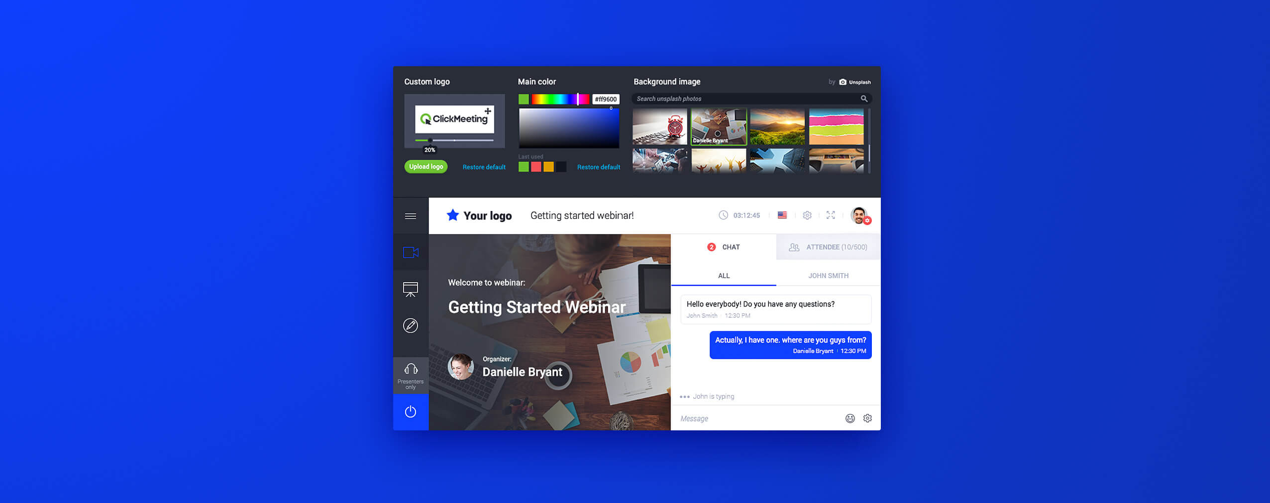
These questions play a huge role also in building your webinar strategy. That’s why we are proud to present you our new webinar appearance settings – your ultimate tool to make your webinar pages look unique and consistent.
Here’s the deal:
Table of Contents
It’s all about triggering emotions
Let’s face it:
Most of the decisions we make every day are under the huge influence of emotions. From choosing a holiday destination or picking an education path, through a career or investment decision, up to signing a meaningful B2B agreement. Our emotions drive us to make a final call in all personal and professional aspects.
How to trigger them?
With good-looking appearance! It has an impact, not only on personal relationships and romantic situations but also in business interactions. We feel safer and more convinced when we land on a campaign landing page, company website, or in a webinar room, where visually everything makes sense. Where a logo is in its place, and colors form a coherent brand identity, and your background image…
…comes from amazing Unsplash free photo base!
That’s right:
From now on, you can set a powerful background image that will appear on all your webinar pages. Our integration with free Unsplash photo directory opens new possibilities when it comes to designing your:
- Webinar Room
- Profile page
- Waiting room, and
- Registration page
You can do it in a few easy steps. First, you need to log into your account. Then, to set up the appearance for a long-distance run, go to your Appearance Settings.
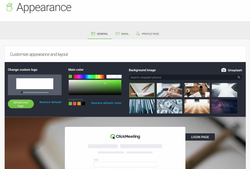
After uploading your logo, and selecting your main color, you can take your time to explore the amazing Unsplash photo base. In the search field, type in a keyword that reflects your business, and – ideally – the one that will describe your niche.
Don’t skip this part!
Discover the pleasure of browsing the results. Scroll down the gallery and pick a photo that will do the best performance as a background image on your webinar pages! Save it, and from that moment, all your online events will have the same, professional and stunning look!
Keep in mind, that you can also customize the appearance of a single webinar. If you like to differentiate a particular event and create specific colors and background for it, you can do it easily. All you need to do is to click “Schedule Event” on your dashboard and go to the “Appearance” tab.
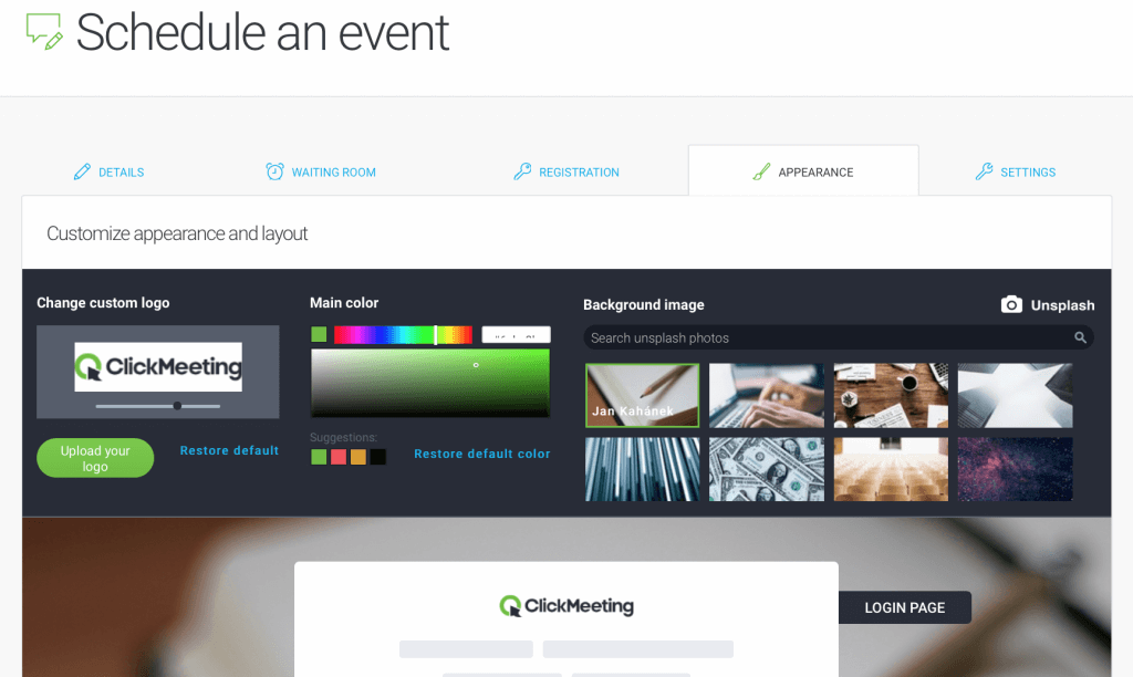
Then, use the same set of tools as before. Decide if you want to change the logo and the main color, and feel free to discover a new outstanding photo to boost your webinar branding.
Design it all in one place
With our new appearance settings, you can now create and customize all your webinar pages from one handy place. You don’t have to tailor each page separately.
Save time and effort and discover how easy it is!
Watch our video tutorial and start impressing your audience with your brand-new webinar appearance!
Ready to stand out from the crowd?
Log into your ClickMeeting account and try our new tool today! Don’t have a ClickMeeting account yet? Try it for free!
