
PowerPoint presentations get a bad rap—mostly because the people who design them don’t really know what they’re doing. It’s not their fault. Many PowerPoint users aren’t professional designers. They’re sales reps, marketing associates, department managers, etc.
But just because you’re not an artist doesn’t mean you can’t craft amazing PowerPoint presentations. You just need to learn the secrets of PowerPoint slide design.
Keep reading to learn seven tips you can use to improve your PowerPoint presentations immediately. Once you implement them, you’ll be able to engage your audience and really get the most out of every PowerPoint presentation you deliver. Let’s dive in!
Table of Contents
1. Keep it Simple

Source: Haiku Deck Blog 
Can we agree that this is a terrible PowerPoint slide? Great, now the question is, what makes it so bad? The main problem is the slide’s complexity. There are too many things going on. You’ll get a headache if you look at it for more than five seconds at a time.
When it comes to PowerPoint slide design, simpler is almost always better. Here are a few ways you can improve your presentations through simplification:
-
-
Limit Your Text: The number of words you use matters. Too many of them will clutter up your PowerPoint slides and make it difficult for your audience to retain information. To get this right, use the 6×6 rule, which suggests limiting each slide to a maximum of six lines of text, and each line of text to a maximum of six words.
-
Use Bullet Points: Your PowerPoint slides should aid your presentation, not distract from it. Full sentences force audiences to read, which prevents them from truly listening to the presenter. Use bullet points instead. That way you can deliver important information in a succinct way that doesn’t divert attention.
-
Minimize Colors: The colors you use should be simple, too. Excessively bright hues will cause eye fatigue. Stick to light and dark tones that compliment each other.
-
2. Consider the Layout of Your Slides

Source: YouTube
Who are you creating your presentation for? Consider the way these folks read. For example, people in most western cultures read from left to right, top to bottom. Knowing this, you can use the layout of your slides to your advantage, as illustrated in the image above.
Notice how the headline, “Rise Up”, is near the top left corner of the slide—exactly where western readers will naturally start reading. The supporting text is right below the headline, followed by a “Subscribe” button. Everything flows in a natural way.
Notice, too, how the background image comes to a point, directing our eye to the important statistic on the right side of the PowerPoint slide.
This aspect of PowerPoint slide design can be tricky to master. Fortunately, you don’t have to! Choose professional slide design templates with interesting layouts. Then simply input your presentation’s information into the template in the appropriate places.
3. Use Contrasting Colors
Source: Brian Tracy
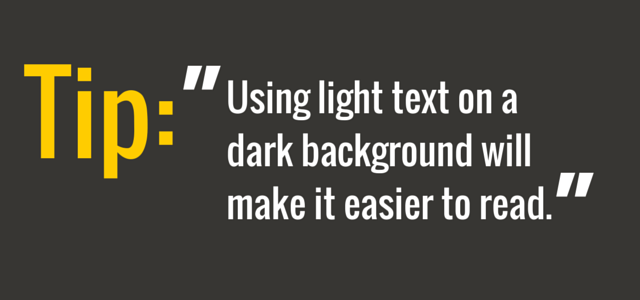
Earlier, we encouraged you to keep things simple and minimize the colors you use in your PowerPoint presentations. Here’s another color tip: use contrasting hues.
For instance, using light text on dark background images will make it easier for your audience to read and understand the information you present to them. But what if your background image has a lot of variations, making some of your text difficult to read?
In these scenarios you have two options:
-
Change Your Background Image: You can eliminate this issue by choosing a background image that is more consistent. That way your text is always legible.
- <
b>Use an Eye-Catching Bar of Color: Keep your preferred background image. But put a small bar of color behind your text to make it easier to read. Here’s an example…
Source: Tuts Plus
See how there’s a bar of color behind the text? This helps separate the words from the detailed background, making them easier to read and understand.
4. Stick With Sans-Serif Fonts

Source: Behance
By now it should be clear: to improve your PowerPoint slide design, prioritize clarity over just about everything else. That’s why we suggest using popular sans-serif fonts like Arial, Helvetica, Proxima Nova, Futura, and Calibri, instead of fun, fancy ones.
Additionally, use a maximum of two fonts per slide and match your fonts to your content.
For example, if your presentation is about an exciting new product your company will release in the new future, you could write your headline in an Oswald font and your text in Lato. Both are sans-serif fonts that look good together and can add an element of excitement to slides.
And since we’re talking about fonts, here’s one more tip: make sure your text is the right size!
What qualifies as an appropriate size for text? As long as the words on each of your slides’ are easy to read, you should be good to go. In most cases, you’ll want to use a 30pt + font.
5. Use Images, GIFs, and Other Visuals
Images, GIFs, and other visuals will help your presentation pop. They’ll also keep your audience engaged and increase their understanding of your material. In other words, visual elements are definitely important to effective PowerPoint slide design!
The trick is choosing the right images. Here are a couple of tips to help:
Play On Emotions
Let’s pretend you’re giving a presentation on the importance of teamwork. What’s the first slide idea that comes to mind? Maybe a picture of professionals working in an office setting.
It’s easy to choose the most literal image. But you’ll likely achieve better results if you go with a picture that relates indirectly to your topic, while tapping into your audience’s emotions.
Remove Distractions
We encourage you to get creative with your PowerPoint slide design and choose inspirational images. But don’t get so creative with your visuals that they become distractions.
The images you choose need to make sense in the context of your presentation. You probably shouldn’t use a cute puppy photo in your technology-related slides, for instance. Instead, find the balance between inspiration and relatability.
6. Adjust Each Image’s Resolution
Hold on to your hats; we’re about to get a bit technical.
How will your PowerPoint presentation be displayed? Your answer will determine the resolution you choose for your image files. Here’s a quick cheatsheet:
-
Use the “On-Screen” setting if your presentation will only be viewed online.
-
Use the “Print” setting if your presentation will be printed and quality is paramount.
-
Use the “HD” setting if your presentation will be viewed on a large projector screen.
To change the resolution of your images, click “File” in PowerPoint. Then click “Compress Pictures” and choose the right option for your unique presentation.
7. Understand Your Audience
This is our final tip, but it might be the most important…
The best PowerPoint slide design ideas are those that relate to your specific audience. So choose text, fonts, images, etc. that will connect with and engage your target viewers.
If you don’t understand your audience, you won’t be able to craft an amazing PowerPoint presentation for them. So get to know your viewers first. Then use that knowledge to create slide designs, text, etc. that you feel confident they’ll appreciate.
Upgrade Your Presentations With PowerPoint Slide Design
There’s no doubt about it. Presentation slide design is important. Fortunately, making sure your PowerPoint slides are well-designed isn’t rocket science. As long as you implement the seven tips in this article, you’ll be able to craft effective PowerPoint presentations.
Delivering your presentation to a remote team? Meet with them on ClickMeeting!
Our popular video conferencing, webinar, and virtual event platform is the best way to connect distributed teams. The best part is, you can use it for free for 14 days. Sign up today to test our tool’s many features—we won’t even ask you for your credit card number!