We’re excited to introduce our new branding. Our constant and never-ending improvements enable us to deliver fresh ideas for our platform. So we came up with a fresh idea for our logo too.
It’s been nearly two years since we launched ClickMeeting — during ad:tech New York in November 2010. Since that time, our product has evolved and our user community has expanded significantly.
We took our clients’ suggestions about how to improve our videoconferencing tool, to meet their needs and deliver innovative solutions that enable them to maximize their business results.
We’re a young, passionate team and we have a ton of fun doing what we love: developing the product and educating our clients on how to host their online meetings and webinars more effectively.
We felt that our new logo needed to reflect our approach — fun and friendly, yet professional.
Table of Contents
Genesis of the logo
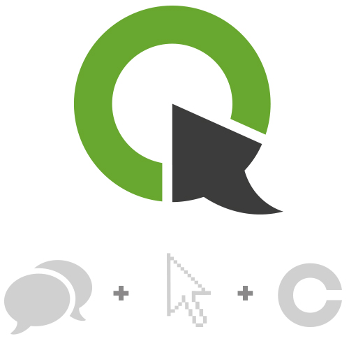
Online communication
+ One Click
+ Letter Symbol
= ClickMeeting
By combining these elements, our designers breathed life and symmetry into our new logo:
![]()
Our colors changed, to give our brand a fresh, new look:
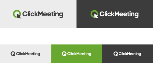
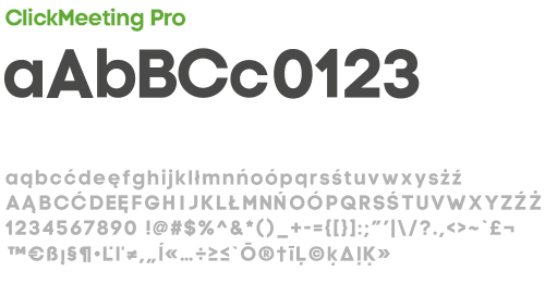
… our very own typeface, called ClickMeeting Pro, was created:
Our easy-to-use use video conferencing tool is constantly enhanced with new features. And Five-Star Customer Service is a top priority for our clients.
We combine these to make it quick and effective to use ClickMeeting — and save time and money.
Love the new logo? Hate it?
Weigh in and tell us in the Comments section below. We can’t wait to find out what you think.
The authors of the most interesting comments will get our cool new T-shirts.