
Today we return to the 1930s to learn about a clever technique that made a company famous. Their method involved presenting advertisements in a series of 4-6 short, sequential messages. Sound like a slide show? Not quite. Let me explain.
The company was Burma-Shave. They made and sold brushless shaving cream. Back then you kept a sliver of soap in an old mug and used a shaving brush to whip it into foam. Sounds quaint today, but brushless shaving cream was new, so they used it as their marketing differentiator.
Table of Contents
Message at a glance
Even back then, billboards were a popular advertising medium. But the driver of a car doesn’t have time to read a lengthy message. So they delivered their value message in short poems — delivered one line at a time in a series of roadside signs:
“Your shaving brush 
Has had its day
So why not
Shave the modern way
With
Burma-Shave”
Travelers, especially the kids, enjoyed reading them, and they became popular throughout America.
Document or Billboard?
Presentation attendees too have a short attention span. So your lengthy slides shouldn’t be considered presentations; they are actually documents. If your content needs lengthy text, maybe it shouldn’t be delivered in a presentation. You might be better off sending your audience a document to review.
Slide Readability
Design your presentation like a series of billboards — each with just enough information to absorb at a quick glance. Nancy Duarte, author of slide:ology, calls this the “3-second rule.” And what makes billboard text readable? Size, for one thing. And also the shape of the letters.

The Brady Bunch font is fun. But imagine trying to read it at 65 miles-per-hour. The quirky shapes and close spacing make it tough to read.

Likewise, script fonts might be a good choice for a classy brochure but not for a billboard or presentation slide.

Here’s a popular serif font. Serif refers to the tiny “feet” at the top and bottom of some letters. It makes lengthy text more readable; (open almost any book, and you’ll find a serif font.) But the feet make it not quite right for billboards and slides.

Fonts of the sans serif family (meaning without “feet”) are more legible for titles, billboards and slides.

When choosing a sans serif font, check the x-height — the height of lower case letters compared to the overall font height. Lower case letters should be more than 50-percent as tall, as in the Arial font.
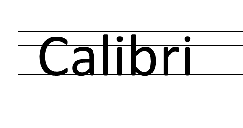
Calibri is another sans serif font that would be good for slides. Notice the x-height.
More Shaving Fun
As Burma-Shave roadside signs became more popular, the company began to run contests, with prizes awarded for sending in empty jars of Burma-Shave:
Free — free
a trip to Mars
for 900
empty jars
Burma-Shave
When a grocery store owner actually sent 900 jars to the company, they replied:
If a trip to Mars
you earn
remember, friend
there’s no return.
But they sent him on vacation to the town of Moers, Germany, often pronounced “Mars” by foreign visitors.
Note: For more quotes, see Wikipedia and The Verse by the Side of the Road: The Story of the Burma-Shave Signs and Jingles, by Frank Rowsom and Carl Rose.
More Font Fun
Powerpoint has many interesting fonts built-in. If you want to get really creative, check Google Web Fonts. This directory grows continually, and all fonts are free to download. Have fun designing your presentations!