What’s your favorite color? That’s a dangerous question when it’s time to choose colors for your presentation design. Red may give you warm-and-fuzzy feelings because you once got a red fire truck for Christmas. But it may be the wrong choice for your audience.
Now I don’t mean that you should ignore your own color preferences. After all, your presentation should be, at least in part, a reflection of you.
Fortunately, there are principles involved. And whether you’re a do-it-yourself designer or decide to hire a design pro, you’ll make better decisions about color if understand some of the principles.
Table of Contents
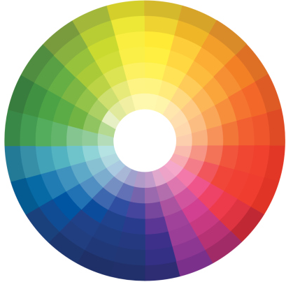
The color wheel is an arrangement of color originated by Sir Isaac Newton. (I guess he had a little time on his hands in between discovering the law gravity and developing his 3 laws of motion.)
The wheel is usually depicted with three primary colors spaced equally — yellow, blue and red — with blended colors in between.
For example, blending yellow and blue produces green. Using more yellow than blue produces a green- yellow; more blue than yellow produces blue-green. Going in the opposite direction, yellow mixed with red produces hues of orange; mixing red and blue produces purple and violet hues.
The colors on the left — green and blue — are said to be cool (soothing) colors; oranges, reds and purples are considered warm (exciting) colors.
Hue is the purest form of a color: no black or white added.
If you add white to a color, you get a lighter tint. Red plus a lot of white produces a pink tint. If you add black, you get a darker shade. Yellow plus a lot of black produces earth-tone shades.
Colors you like may not go well together: green and purple might be tough to match. Try these color strategies, based on the color wheel.
As you might imagine, the color combinations become more daring and harder to work with as you work your way top-to-bottom along that list.
The amount of contrast can make a dramatic difference in the impact of your design.
Designers use the expression high-key to denote a design with a lot of light and a great deal of contrast: black text on a white background, for example. Low-key means darker images, and lower contrast: imagine an oatmeal color on a tan background.
Designs that are too high-key can look too “busy.” Designs that are too low-key can look murky, and details don’t pop out. Balance is critical for effective “key.”
For formal presentations, try a darker overall design with a somewhat lower key. For informal meetings, a lighter design with higher key may be just right.
Spend some time looking at websites of others in your industry. You may see color-use patterns.
An obvious example is companies that are environmentally friendly (or want to be perceived that way.) Green is a natural choice.
B2B companies that serve larger companies often use blue. Maybe they’re picking up some of the prestige of IBM blue.
Companies that position themselves as innovators often use bright colors.
There’s no need to follow your industry slavishly, but make an informed choice and be careful about a too-radical departure from your industry’s image.
As you can see, there’s no easy answer to the issue of color in designs. So use your best instincts then consider how your choices align with the principles you’ve just learned.
If you need a little help, consider hiring a designer if it’s within your budget. An investment in your brand can pay off for year to come.
Or if you’re a dedicated and enthusiastic do-it-yourself designer, go for it!
Looking to grow your network marketing business? Invest in an MLM webinar! MLM webinars will…
Are you growing your knowledge transfer business or just wondering if it's the right direction?…
Discovering the numbers behind your webinars is the crucial factor for measuring your webinar success.…
Looking to host a must-attend coaching session? Maybe you're a marketing consultant and want to…
If you're working alone, you'll have to accept this fact: you won't split yourself in…
Your virtual classroom comes with everything you need to teach online. Just like in a…